Visual identity | Campaign design | Website design
Project Fearless: Branding a social enterprise that’s helping girls to become whatever they want to be
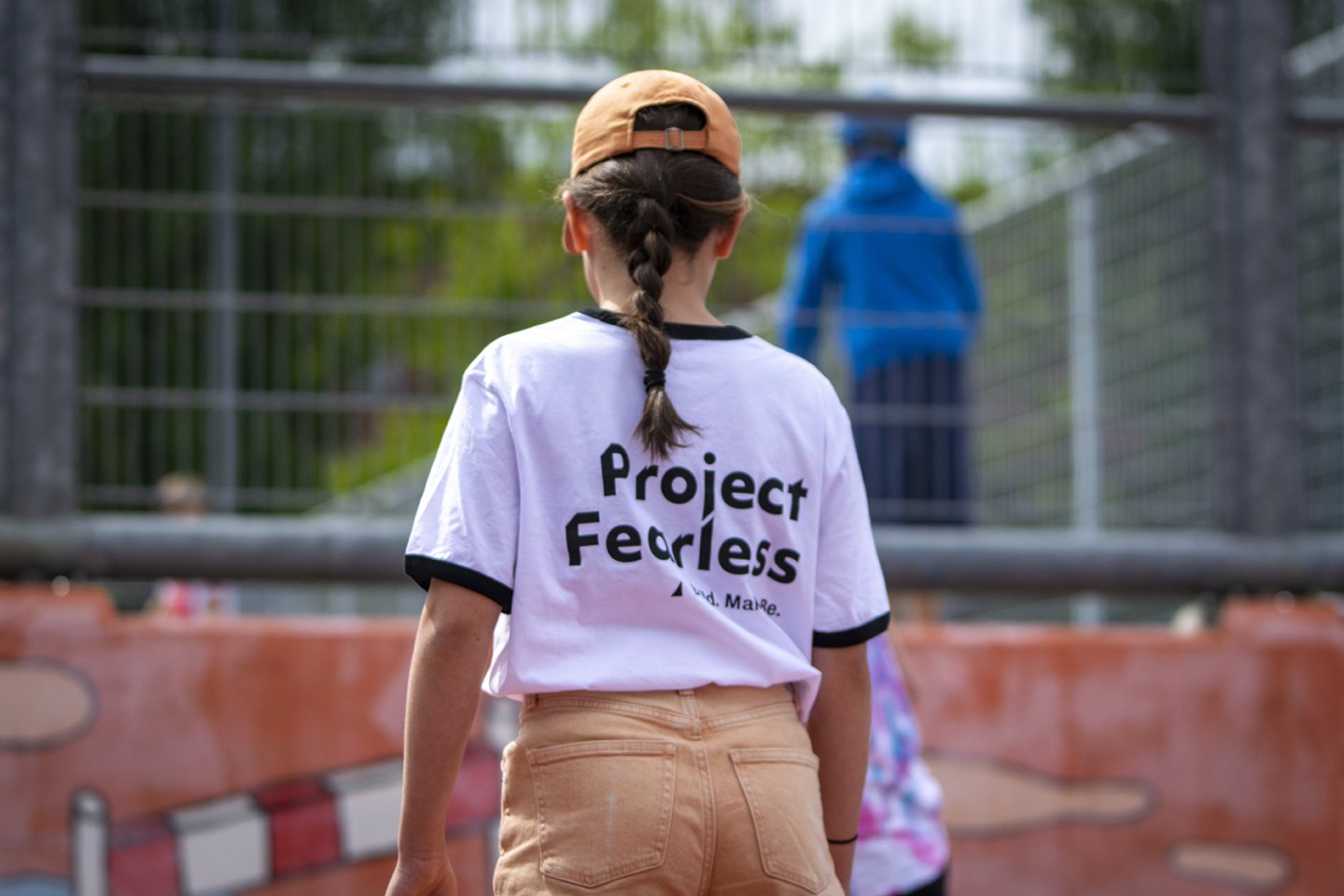
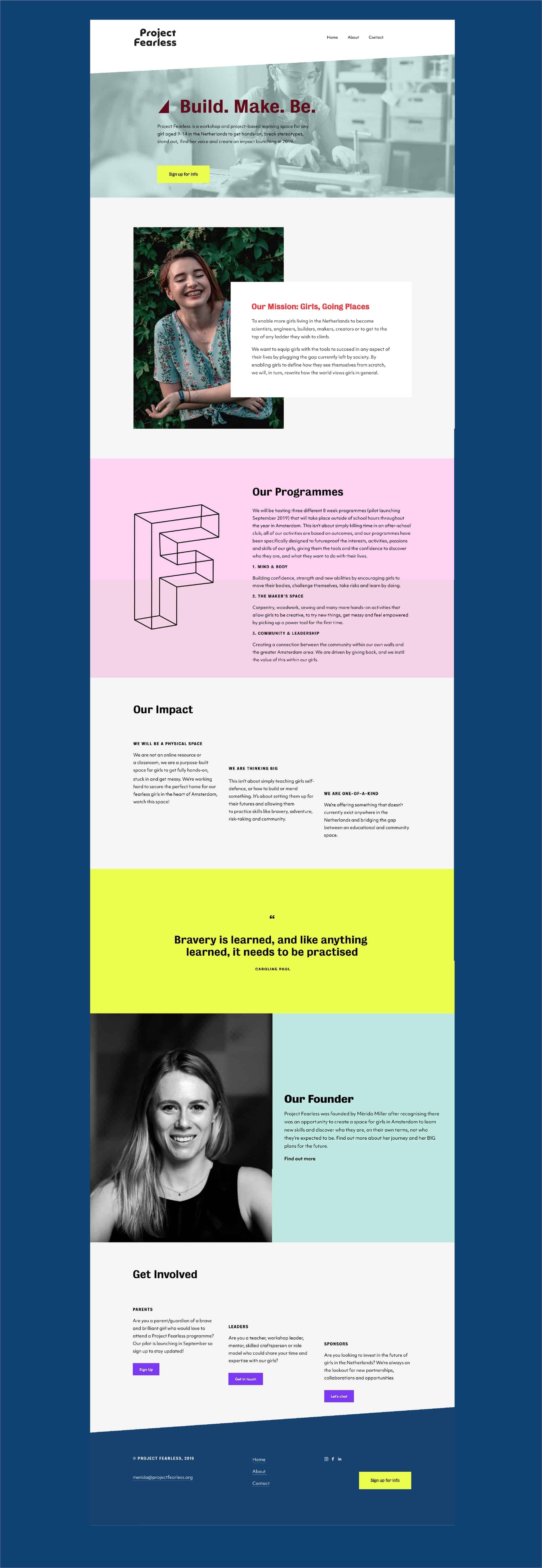
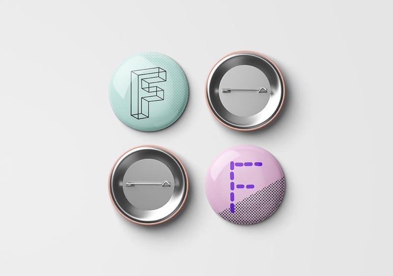
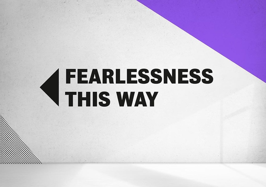
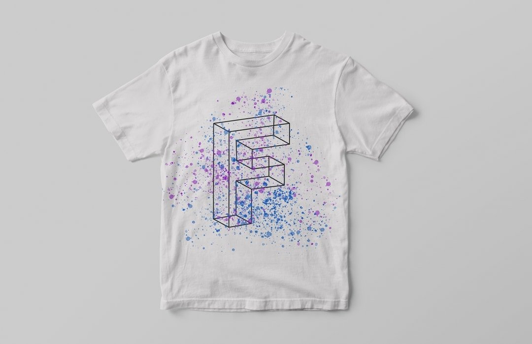
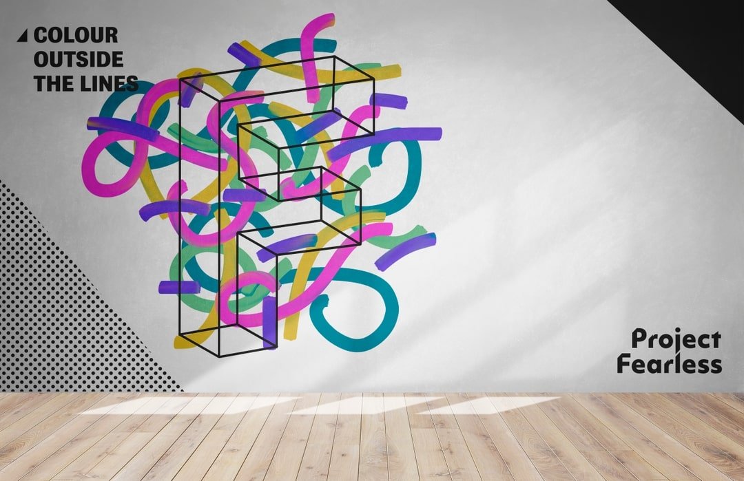

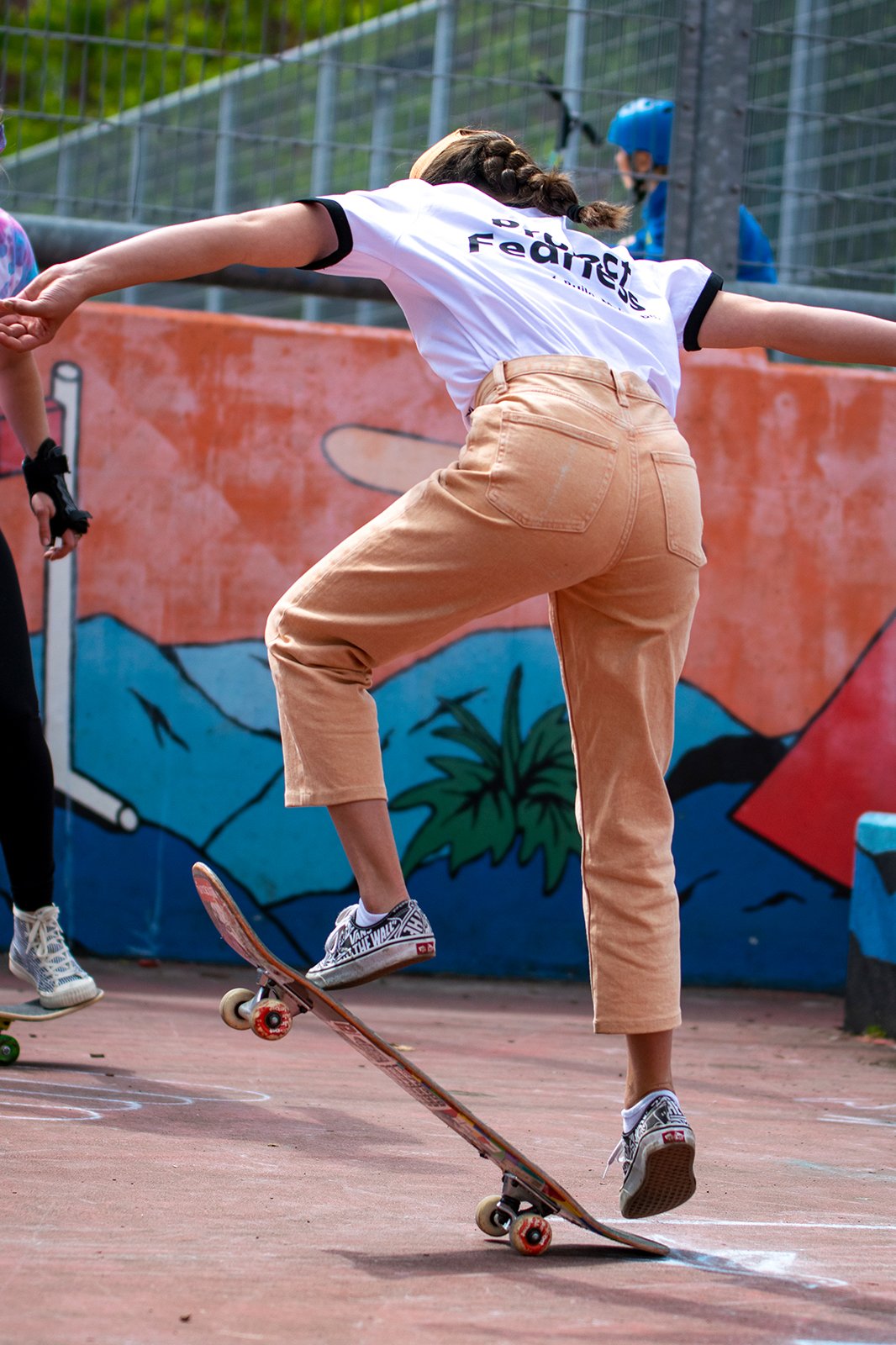
Project Fearless is a workshop and project-based learning space for any girl aged 9-14 in the Netherlands to get hands-on, break stereotypes, find her voice and create an impact . I worked closely with strategists Mac + Moore and founder Mérida Miller to create the brand proposition, visual identity and launch to market.
Project Fearless aims to enable more girls to become scientists, engineers, builders, makers, creators or to get to the top of any ladder they wish to climb. They want to equip girls with the tools to succeed in any aspect of their lives by plugging the gap currently left by society. ‘By enabling girls to define how they see themselves from scratch, we will, in turn, rewrite how the world views girls in general.’
The brief for developing the identity for Project Fearless was to ‘make a difference with not only what we do but the way we look.’ Project Fearless’ mission already set them apart from many non-profits in the Netherlands and they needed their branding to back this up. Founder Mérida wanted ‘to attract the right type of audience for their programs. The branding needed to be relatable to the audience in an inspiring way and make them want to be part of Project Fearless.’ The branding also needed to be fully inclusive for women and girls of different backgrounds, but also accessible to sponsors and fundraisers.
It was important for the branding to feel encouraging and empowering to the girls and families that interact with it across all touch-points. It needed to reflect Project Fearless’ audacious and inspiring message, and encourage girls to take part and feel galvanised.
The chosen solution for the branding stems from the idea of ‘Finding your fear.’ It is all about fitting in, yet standing out. Project Fearless is what you make it and is personal to you. You are part of a group and a wider movement, but also developing yourself as an individual.
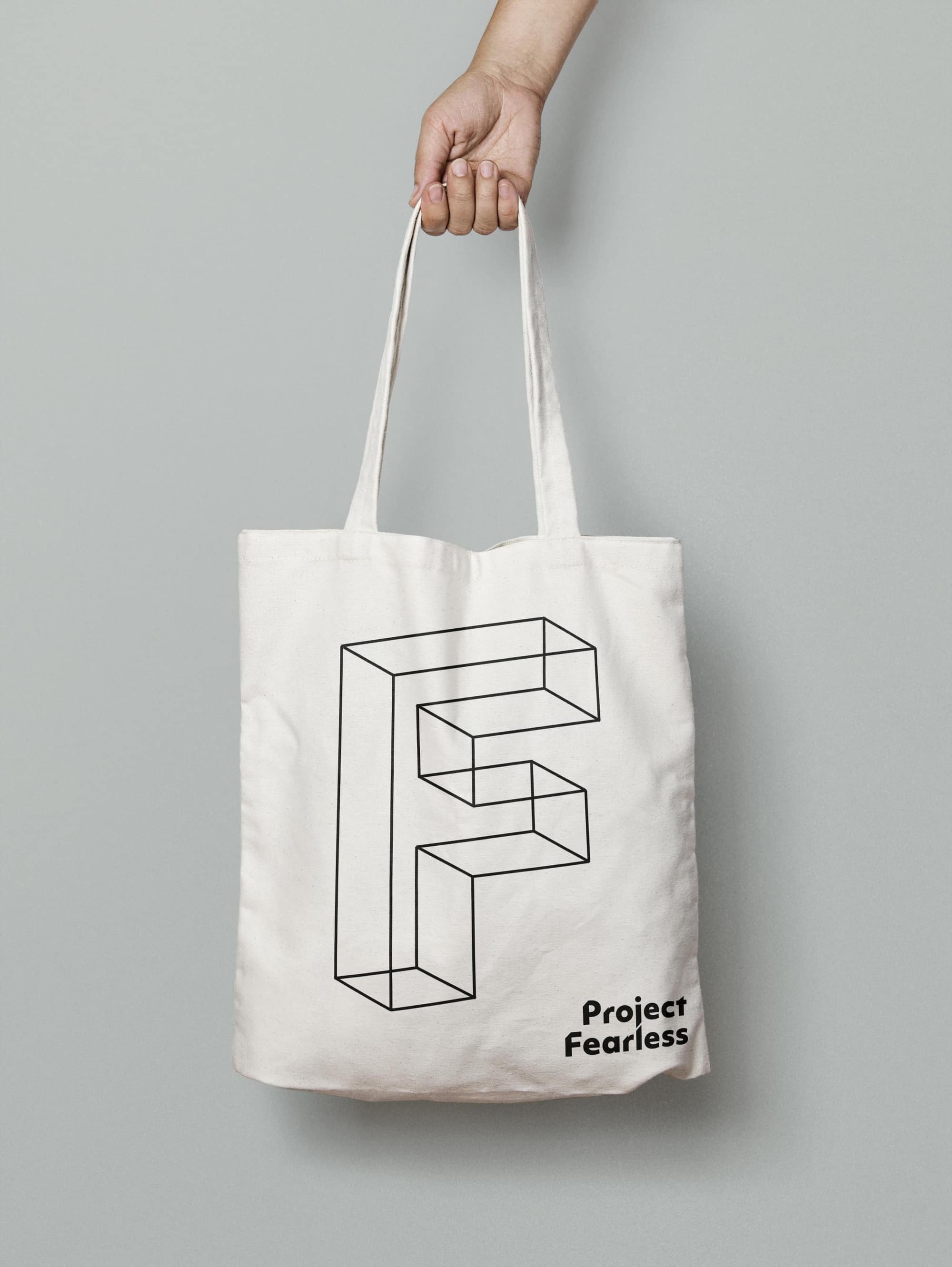
The brand concept is rooted in the idea of building and connecting which is reflected in the type styling of the logo. It also alludes to the idea of being ‘cutting edge’ and going against the norms. The identity also utilises triangles which are known to be the strongest shape. The identity uses the letter ‘F’ for Project Fearless as a symbol of difference.
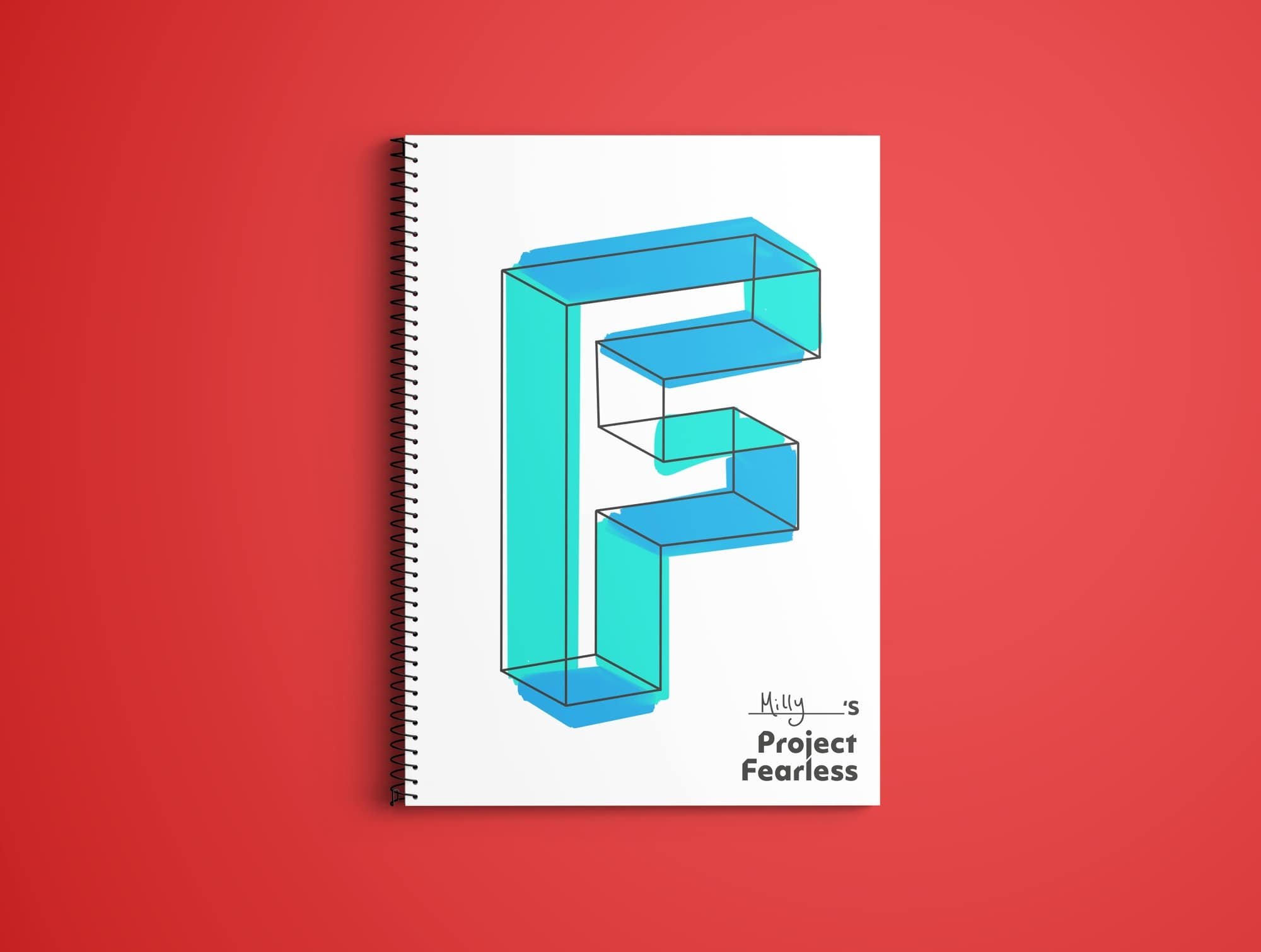
It was also important to me to develop an identity that had an element of interactivity within it. So that the girls who join Project Fearless can really feel as if they are part of a wider movement and helping to build and shape Project Fearless as it grows. The identity does this through a number of touch-points that can be coloured in, painted and personalised. For example, the notebooks can be made personal to each individual but also very much part of the Project Fearless brand.
Mérida Miller - Founder, Project Fearless
“You can tell her designs are thought through far beyond just the initial “visual appeal”, and this has been huge when bringing energy and life to our brand. I am over the moon (not an exaggeration) with the look and feel of Project Fearless and PROUD of the visual identity that is our brand. I’m so thankful I met Maddy at the beginning of starting Project Fearless, moving forward I don’t have to second guess who I will turn to for design work.”

