Visual identity | Brand application | Art direction | Website design
SAVU: Designing the identity for a sauna brand that is inspired by Finnish tradition and built using authentic craftsmanship
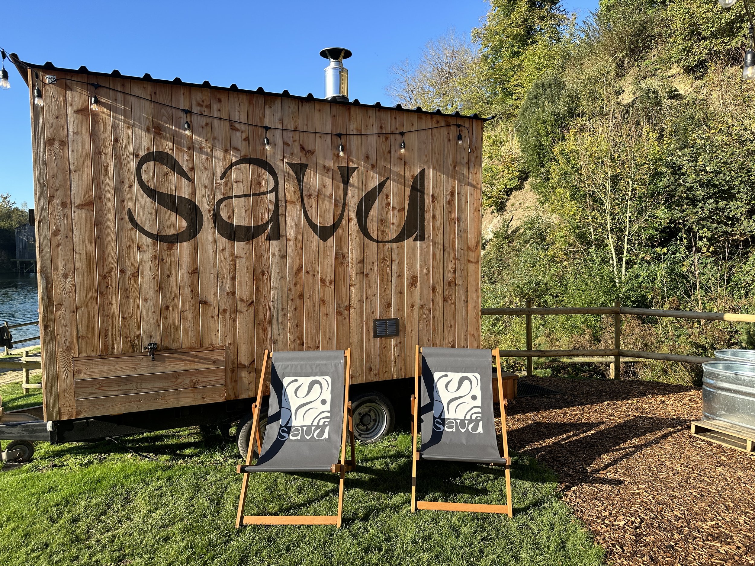

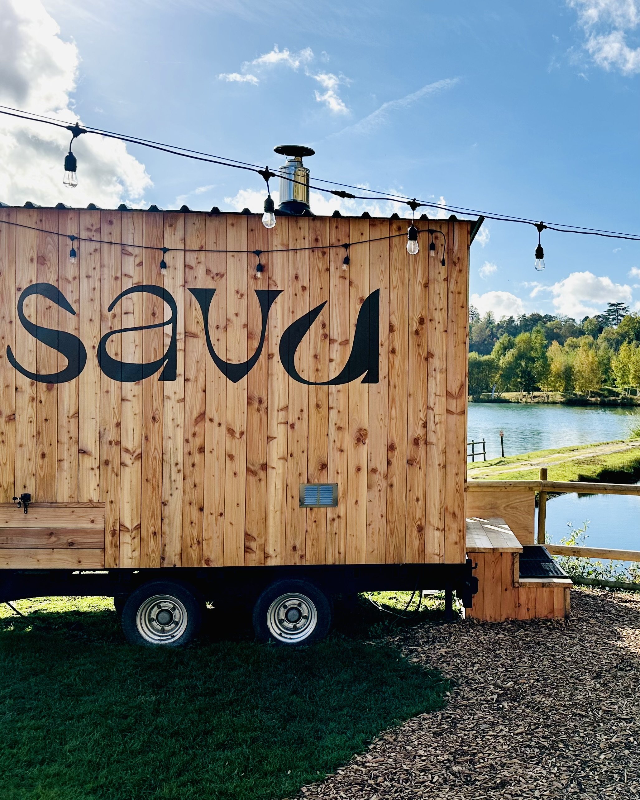


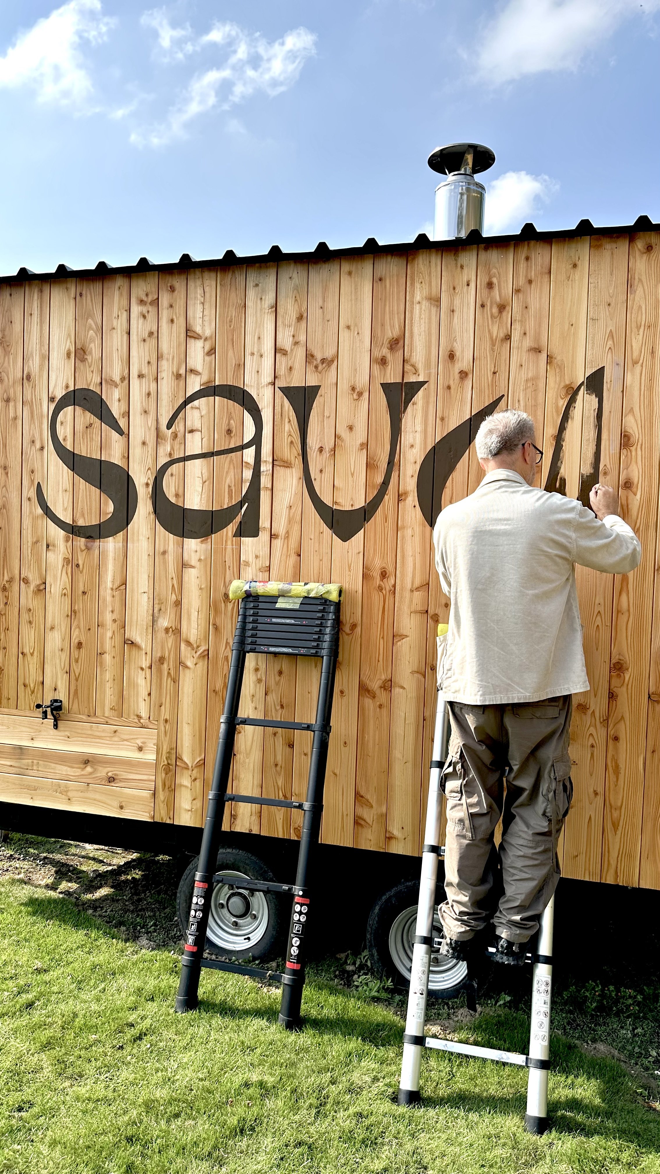

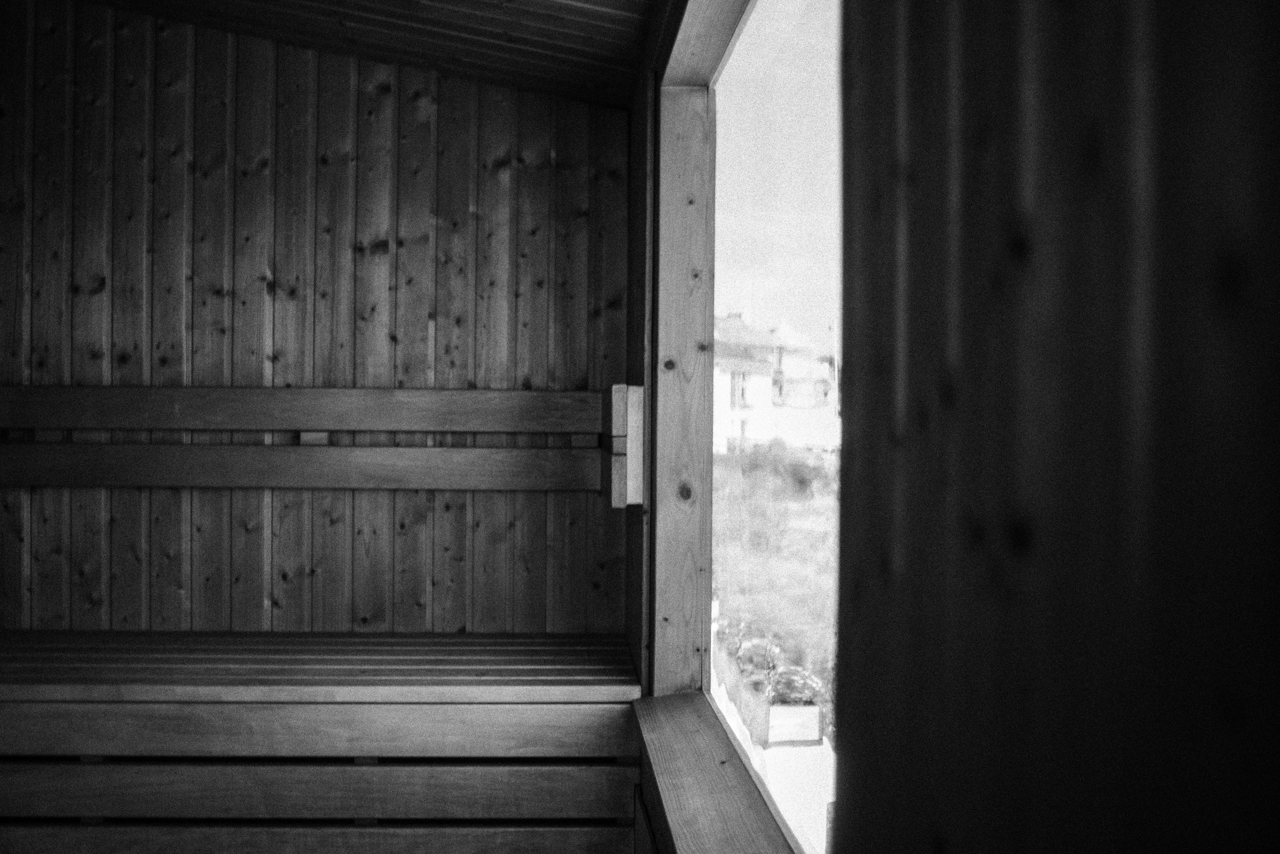


SAVU is Savu is a new venture co-created by James Daly, a personal trainer based in Epsom. SAVU is opening a sauna inspired and influenced by Finnish tradition and built using authentic craftsmanship.
They key challenge when developing an identity for Savu is to create standout and longevity in a space that is slowly becoming more saturated. There has been a huge movement towards people using wellness spaces for mental, physical and social benefits, so creating a brand that people connect to is key.
Savu is a brand founded on fun, light-heartedness and a desire to promote better mental and physical wellbeing amongst its users. People are at the centre of what Savu stand for and as a community and wellness space, it was essential to ensure the brand was built on insights about its customers, and not assumptions or trends.
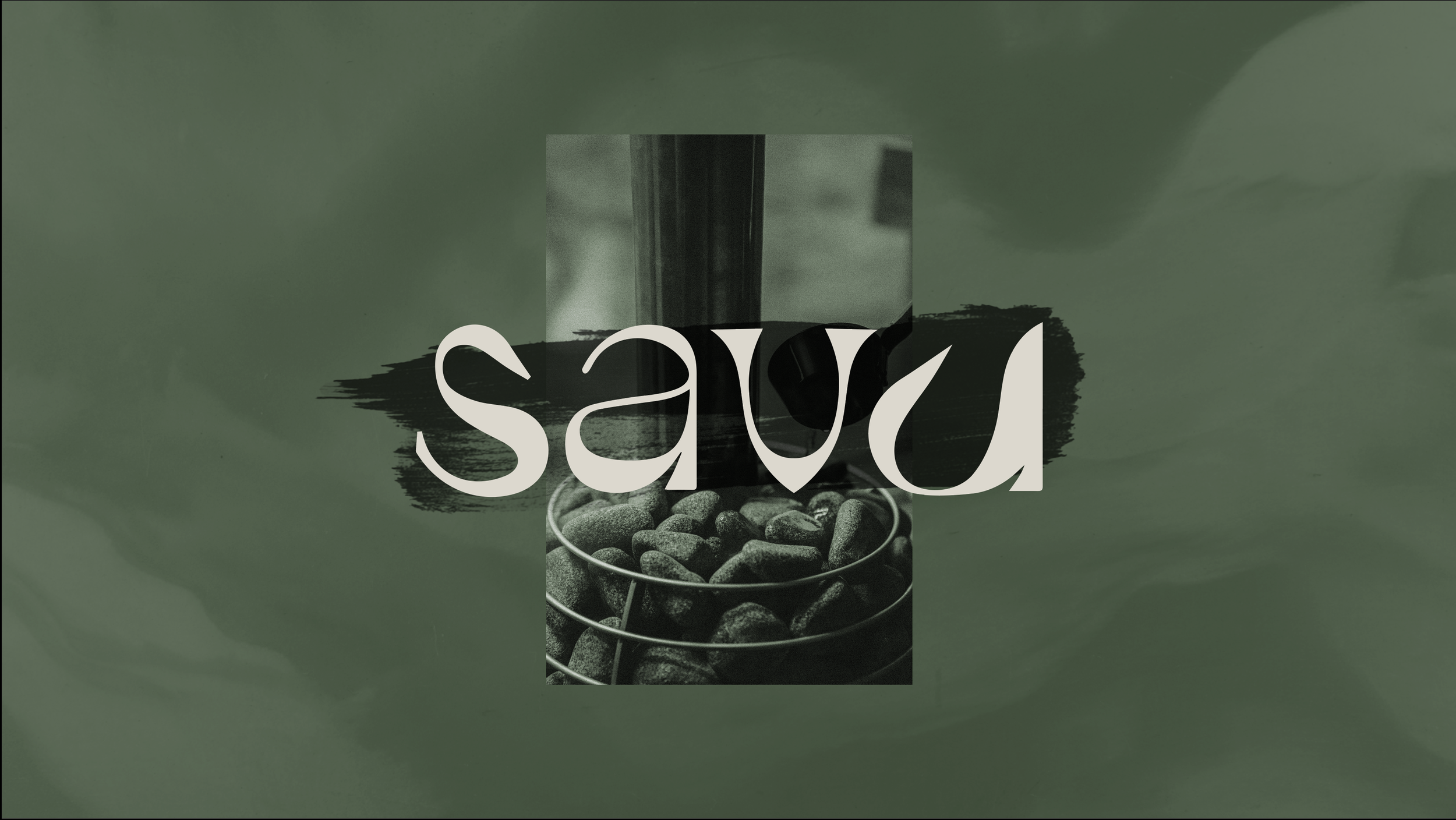
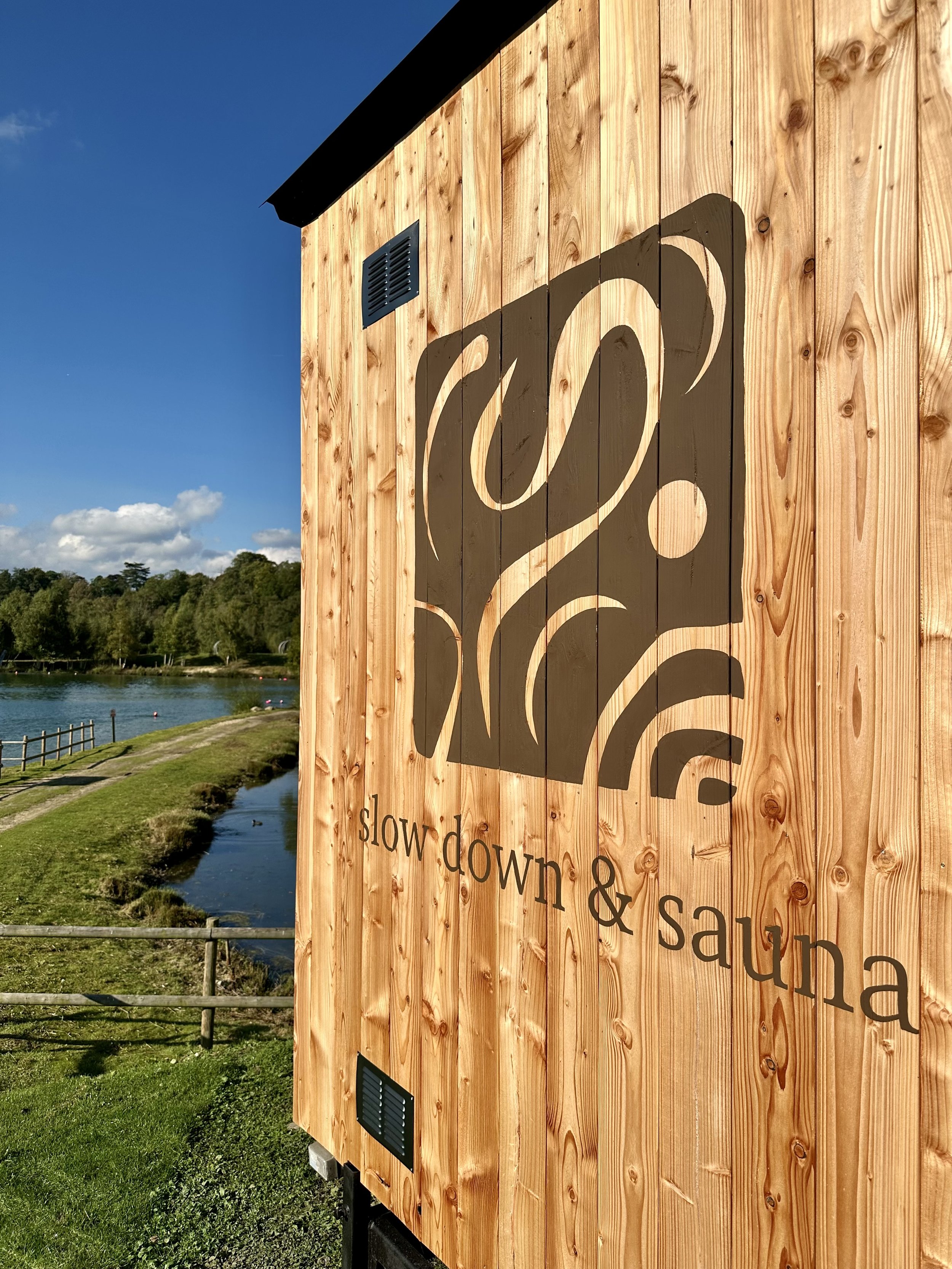
The Savu logo is a typographic mark inspired by the shapes created by the smoke and steam within the sauna. It is simple yet creates a sense of the calm, fluid feeling people get when spending time in the sauna. The identity includes shapes and textures drawn from the four elements which all make up part of the sauna experience:
Earth = wood of the building
Air = steam produced
Fire = the heat source
Water = to splash on the coals
The chosen colours reflect the earthy and grounded feel of the sauna and its place in nature. The lime green colour adds contract to the palette as an accent colour to symbolise energy and vitality which is a by-product of spending time in a sauna - calming and grounded yet energised and rejuvenation.
James Daly, Founder SAVU
“You're a star. Thank you so much. It all looks great. I am so grateful for all of your amazing effort and talent. You have brought Savu to life! Thank you so much.”

