Visual strategy | Visual identity | Brand application | Website design
The Parent Education Company: Branding an online learning platform that brings parents-to-be high-quality, interactive, empowering online parent education.

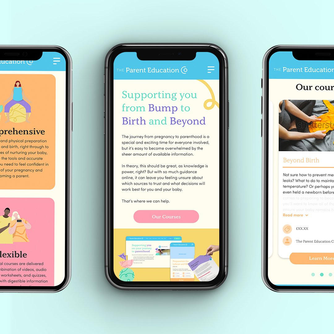
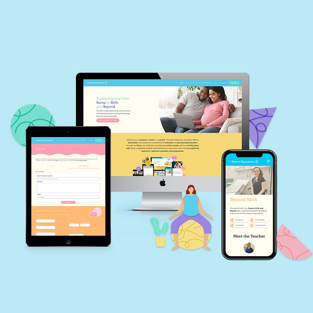
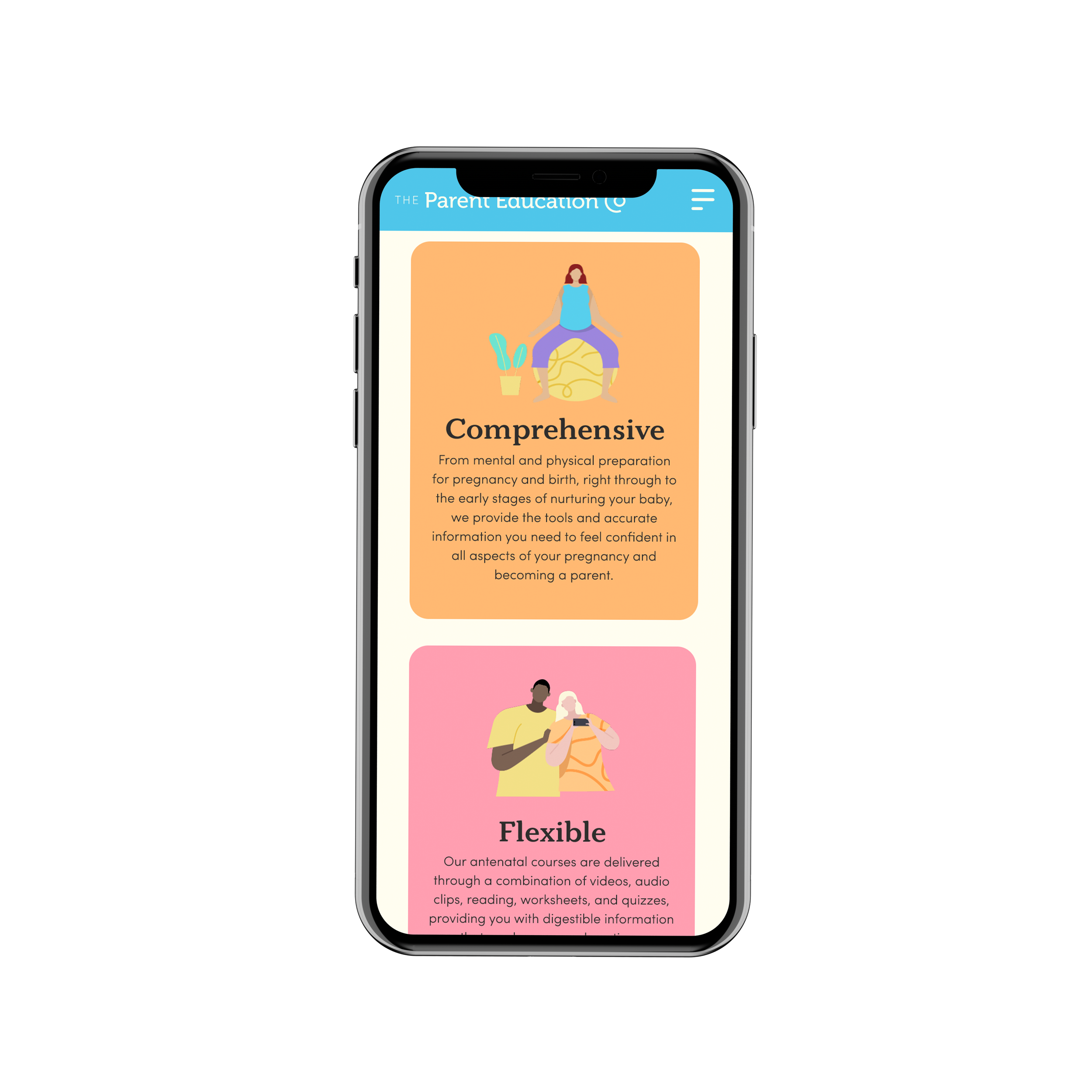



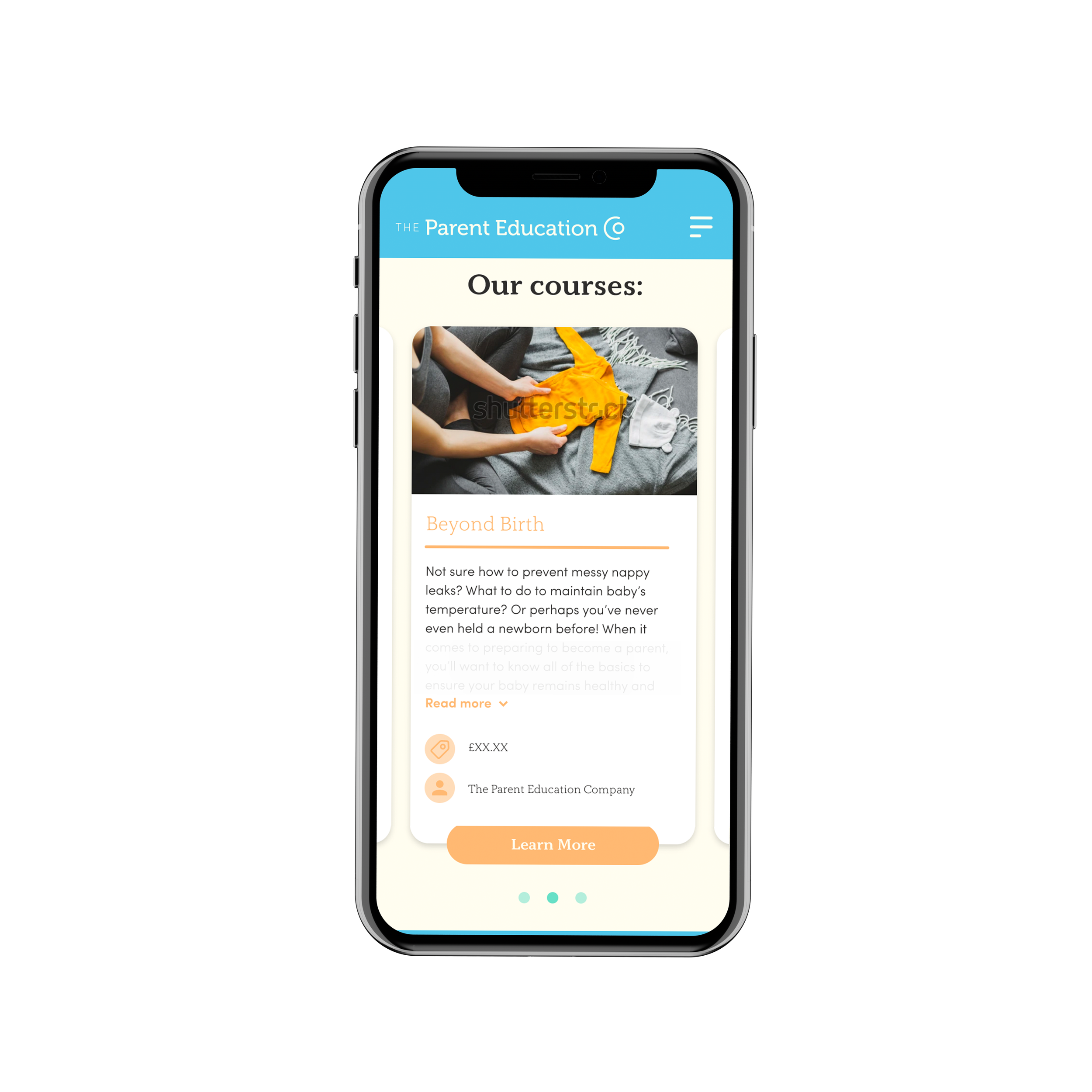

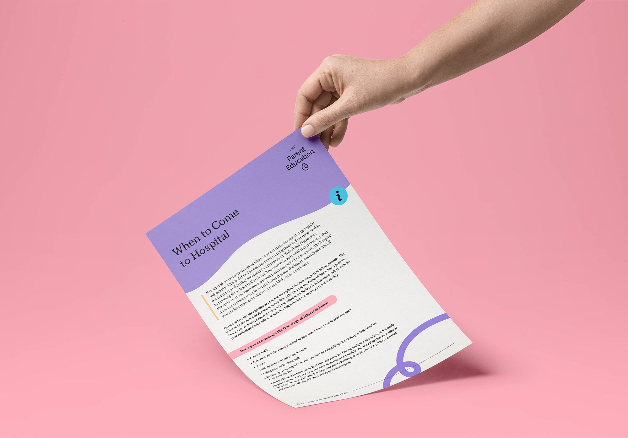


The Parent Education Company is an online learning platform that brings parents-to-be high-quality, interactive, empowering online parent education. Born during the Covid-19 Pandemic, it became clear that there was a need for a platform like The Parent Eduction Company that offers the ability for expecting couples to learn in a safe online space.
It also became apparent that the demand for support was high – during a time where pregnancy could feel even scarier and lonelier than ever. Founded by midwife Emma Gasking, their platform offers a subscription with access to a comprehensive antenatal and early postnatal education through a forum, a collection of professional online courses, and monthly group calls, led by a registered midwife and produced by a passionate team including experts by experience, healthcare specialists, and professionals.
I worked closely with Founder, Emma to establish the brand strategy and visual positioning before developing the brand identity. We established that the brand positioning should be the perfect balance of professional but with a strong personality and playful touch. Ensuring it appeals to grown-ups but with a hint of childlike light-heartedness to make it feel fun and engaging.
The current market for Parent Education is limited and focuses on the two market leaders, one of which is the NHS antenatal classes. Visually, the current market lacks personality and engaging visuals that are going to grab the attention of tired, time poor and potentially overwhelmed parents. We wanted to create a brand that stands out, feels empowering and gets parents excited about parenthood with information they can trust.
It was clear that there was a huge gap in the market for a brand that speaks to new parents in a grown-up way but also feels appropriate for the baby and early-years market and that is visually a bit more fun and engaging than what’s currently out there. It was important to establish a brand that felt as if it had easy, digestible information laid out in an accessible and approachable way that encourages people to learn and not just feel like it’s another thing on their to-do list.
The concept behind the identity is rooted in the idea of nurturing and protecting. It draws on the idea of pregnancy within the logo as a symbol of protection, nurturing and care. The brand mark is simple and reflective of this idea of security and assurance. The idea is that The Parent Education Company looks after you, and you in turn look after your baby. It also nods to the idea of long-term support and care, and that we are here with you on the journey from pregnancy through birth and in to parenting. The identity is bold in its applications, yet uses a pastel colour palette to soften it and bring a nurturing edge. It is serious and appeals to adults, yet draws on the childlike playfulness that will help The Parent Education Company to stand out in the market.
Emma Gasking - Founder, The Parent Education Company
“It has been an incredible experience working with Maddy. Her listening skills and her ability to take what is in your head and convert it into something real and tangible are exceptional. She has very high standards, is very professional and organised meeting tight deadlines with no problem. As we were working to such a tight schedule communication was essential and it was very reassuring to receive the regular updates and feedback throughout the project. Her enthusiasm, dedication and positivity flow through all of her work and she has been an invaluable asset to the team in the lead up to the first launch. I have thoroughly enjoyed working with Maddy and will definitely be using her for all the future branding of the business”

